component
Link Preview
An unfurled link card, as a thumbnail row or with a large image on top.
Install
npx shadcn@latest add https://whatsapp-components.crafter.run/r/link-preview.jsonWrites 4 files into your project, and installs clsx and tailwind-merge.
Preview
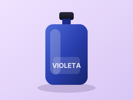 Violeta · Perfumería artesanalFragancias en pequeños lotes. Envíos el mismo día dentro de la ciudad.crafter.runTe dejo la tienda por si quieres pasar 🙂Perfume Violeta 50 mlcrafter.runEste es el enlace directo.
demos/link-preview.tsx
import { LinkPreview } from "@/registry/whatsapp/link-preview";
import { MessageBubble } from "@/registry/whatsapp/message-bubble";
import { MessageMeta } from "@/registry/whatsapp/message-meta";

export default function Demo() {
  return (
    <div className="flex flex-col gap-3">
      <MessageBubble
        direction="out"
        meta={
          <MessageMeta timestamp={new Date(2025, 0, 6, 18, 20)} status="read" />
        }
      >
        <LinkPreview
          url="https://crafter.run/tienda"
          title="Violeta · Perfumería artesanal"
          description="Fragancias en pequeños lotes. Envíos el mismo día dentro de la ciudad."
          imageUrl="/perfume.svg"
        />
        Te dejo la tienda por si quieres pasar 🙂
      </MessageBubble>

      <MessageBubble direction="in">
        <LinkPreview
          url="https://crafter.run/violeta-50ml"
          title="Perfume Violeta 50 ml"
          imageUrl="/perfume.svg"
          large
        />
        Este es el enlace directo.
      </MessageBubble>
    </div>
  );
}
Props
Read from LinkPreviewProps in the component source at build time.
| Prop | Type | Default |
|---|---|---|
titlerequired | string | — |
urlrequired | string | — |
className | string | — |
description | string | — |
imageUrl | string | — |
largeLarge image on top instead of a thumbnail beside the text. | boolean | false |
siteName | string | — |
Files
- registry/whatsapp/link-preview.tsx
- registry/whatsapp/cn.ts
- registry/whatsapp/whatsapp.css
- LICENSE