component
Product Card
Thumbnail, title and price inside a bubble. The card that turns a chat into a storefront.
Install
npx shadcn@latest add https://whatsapp-components.crafter.run/r/product-card.jsonWrites 4 files into your project, and installs clsx and tailwind-merge.
Preview
¡Sí! Nos queda en stock 😍 Te lo muestro: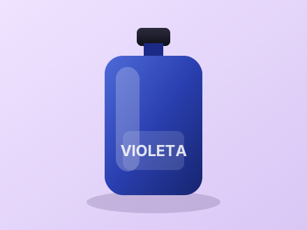 Perfume Violeta · 50 ml$ 65.000
Kit descubrimiento$ 38.000Cinco muestras de 2 ml, una por familia olfativa.demos/product-card.tsx
import { MessageBubble } from "@/registry/whatsapp/message-bubble";
import { MessageMeta } from "@/registry/whatsapp/message-meta";
import { ProductCard } from "@/registry/whatsapp/product-card";

export default function Demo() {
  return (
    <div className="flex flex-col gap-3">
      <MessageBubble
        direction="out"
        meta={
          <MessageMeta timestamp={new Date(2025, 0, 6, 20, 2)} status="read" />
        }
      >
        <span className="mb-1.5 block">
          ¡Sí! Nos queda en stock 😍 Te lo muestro:
        </span>
        <ProductCard
          title="Perfume Violeta · 50 ml"
          price="$ 65.000"
          imageUrl="/perfume.svg"
          imageAlt="Perfume Violeta"
        />
      </MessageBubble>

      <MessageBubble direction="in">
        <ProductCard
          stacked
          title="Kit descubrimiento"
          price="$ 38.000"
          imageUrl="/perfume.svg"
          description="Cinco muestras de 2 ml, una por familia olfativa."
        />
      </MessageBubble>
    </div>
  );
}
Props
Read from ProductCardProps in the component source at build time.
| Prop | Type | Default |
|---|---|---|
pricerequired | string | — |
titlerequired | string | — |
actionA button or link under the price. | ReactNode | — |
className | string | — |
description | string | — |
imageAlt | string | "" |
imageUrl | string | — |
priceClassName | string | — |
stackedStacks the image above the text instead of beside it. | boolean | false |
Files
- registry/whatsapp/product-card.tsx
- registry/whatsapp/cn.ts
- registry/whatsapp/whatsapp.css
- LICENSE